
PlantPal — A Simple Houseplant Emotion Tracker
“Your plants can’t speak, but PlantPal will help you listen.”
Role
UX Designer (this was a personal project to practice end-to-end UX design.)
Timeline
April - July 2025
Skills
User Research
Interaction Design
Visual Design
Prototyping
App Concepting
Tools
Figma
FigJam
Canva
OVERVIEW
What is PlantPal?
Many new plant owners struggle with knowing how their plants are doing beyond just watering them, me included! PlantPal is my personal UX case study from Google’s UX/UI Design certificate, courtesy of Coursera. PlantPal is a beginner-friendly mobile application that is designed to help users log their plant care routines and track how their plants “feel” by using emojis, visual cues, and simple inputs like leaf color, droopiness, and growth.
THE PROBLEM
New plant owners often struggle to understand how their plants are doing. Most plant care apps are either complex, or they assume a certain level of expertise.
I’ll be honest. I’ve never been good at taking care of plants. Having a green thumb? Forget about it! I’ve always admired my mother’s ability to nurture and take care of literally any plants inside or outside of my childhood home, especially in the humid and hot Summers in the L:ower Coastal Plains of Georgia. And here I am, in my early thirties, holding the emotional and mental weight of having killed a succulent at one point. When trying to think of an app idea for my project during the certificate program, I asked myself, “what is a simple, everyday task that I and maybe a lot of other people have a problem with doing?” And that’s when it dawned on me. Taking care of plants!
After identifying what the problem was, this was the goal I’d set for myself to solve this problem - to design a simple, friendly, and intuitive mobile app to help beginner plant owners monitor their plant’s wellbeing using emotional cues, basic inputs, and visual feedback.
USER RESEARCH
What are some common pain points for beginner plant owners?
I wanted to gain a better understanding of how people feel about their ability (or lack thereof) to take care of plants. Through interviewing some of my friends and looking through comments on plant care TikTok, Instagram, and Reddit, for example, I was able to identify a few common grievances and key insights. Through analyzing this user research, I developed three user personas that I felt could best embody my target audience’s needs, pain points, and goals, using this slide show presentation. Using the arrows at the bottom of the slideshow, you’ll be able to see each of the personas, their bios, and their goals and frustrations. With these personas and the information I’d gathered, I felt I became informed enough to venture into the Ideation process in order to inform what the design for PlantPal would look like.
Note: These pictures for my personas are stock photos from Unsplash. They aren’t people I actually know!
IDEATION
Exploring key features to implement that will make the new plant owners feel a sense of calm and prepared to take on this new responsibilty.
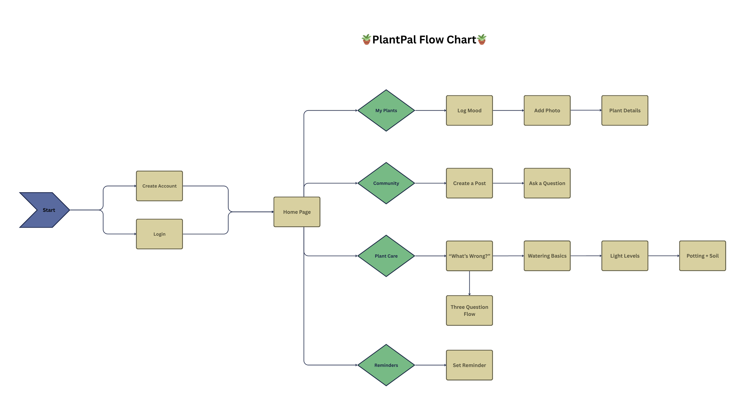
After taking my user research and figuring out key pain points, or frustrations, to address, I brainstormed and mapped out an information architecture to structure out an outline of what the app [theoretically] would work like, followed by creating a user flow chart. Most plant care apps, from what I saw, were overbuilt or data-heavy and seemed to be aimed at botanists or hardcore plant hobbyists. Also, so many helpful features were hidden behind paywalls. With that in mind, I wanted the key features of the app to be engaging and simple, but also not overwhelming.

Prototype & Iteration
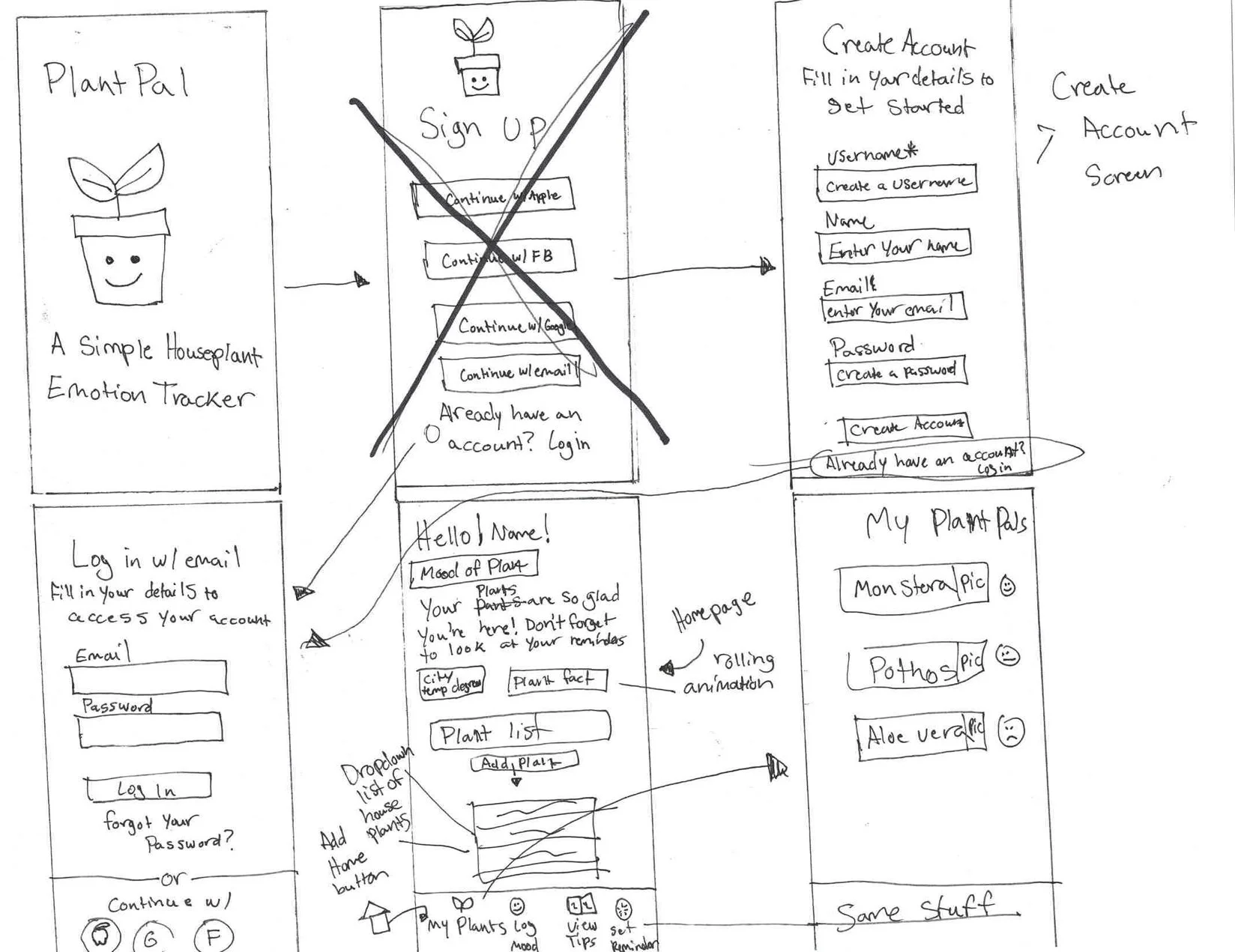
Next, I created low-fidelity sketches in order to consolidate any potential ideas I had to envision what the core features of the application would look like. These included My Plants, Community (formerly Friends/Feed), Plant Care (formerly Diagnose), and Reminders (formerly Schedule) features. I threw away a few of the ideas I had before, as I didn’t really feel they were suitable, so these were the sketches I ended up with.
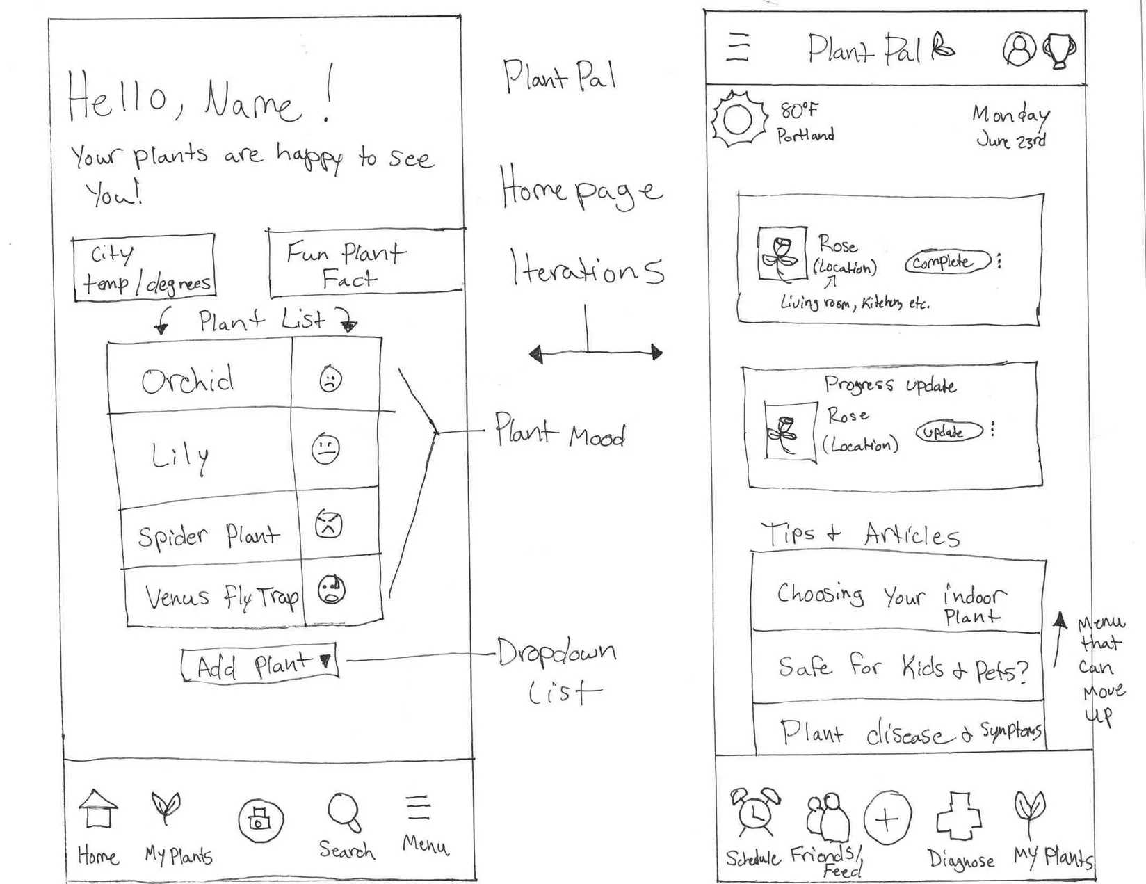
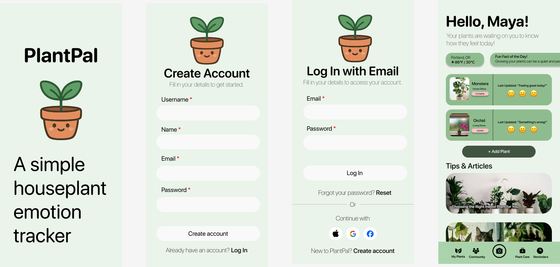
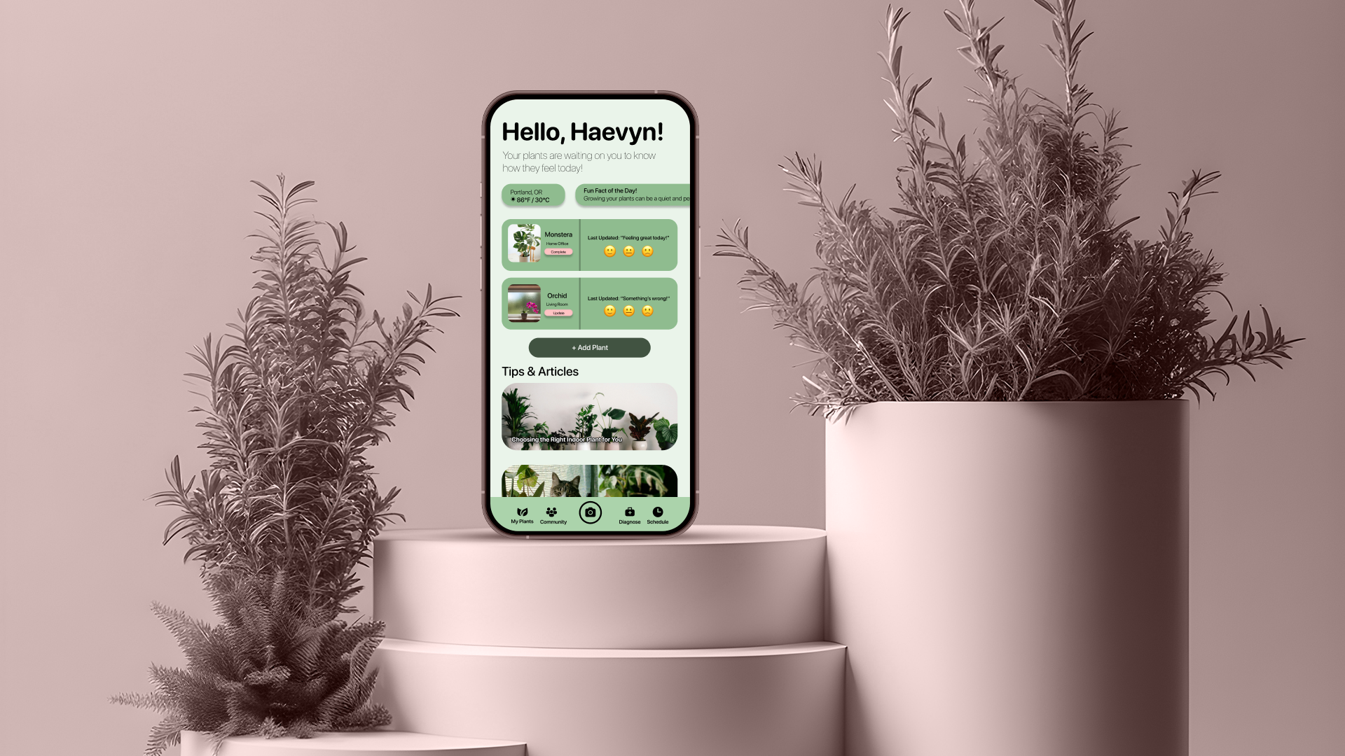
Next, I created high-fidelity sketches. I decided to take elements from both iterations of the home page to create a new homepage, essentially getting rid of the “My Plant Pals” screen entirely, as I felt it was no longer needed. The reason I felt that screen was no longer needed is because if I had created that screen, then the information on that screen and the home screen would’ve been redundant, which, to me, isn’t a mark of good design. I showed these designs to a few others on a Discord chat I’m in they felt the screens seemed self-explanatory and would be easy to navigate. Where the problem was, initially, was the color scheme I initially used, which was mainly beige and green. They thought it was bland, flat, and boring, so in asking them if I used mainly greens in varying shades instead, would that help, and after showing them, they thought it looked better, so I decided to keep it. Choosing the greens actually made the things like the pictures and emojis pop more as well, and I’m very happy with the decisions I made here!
What I learned
This was a fun process! It’s funny that in my years of using technology, and subsequently, apps, I never paid that much attention to how much goes into the process, at least from a UX/UI standpoint, and how detailed it can be! Admittedly, I got a little discouraged doing this project and stopped for a little bit, and as a result, I lost my mojo trying to pick back up where I left off. Of course, that’s common in any sort of design space, tech or otherwise, but the important thing, to me at least, was that I saw this project to the end, even if it wasn’t perfect, or at least, as “perfect” as I wanted to be in mind, and showed that even though this was my first project, that I could at least understand the steps necessary to complete a design, especially without a team.